

(Tidy Tuesday is a project to supply weekly data sets for R users to practice their coding skills on. You can find full details here.)
This week’s Tidy Tuesday dataset makes use of the friends package put together by Emil Hvitfeldt. It contains a bunch of datasets put together by analysing the transcripts of the TV show ‘Friends’.
One of these datasets includes ’emotions’, categorised into one of seven groups that included the emotions ‘joyful’ and ‘sad’. These describe the emotion being expressed at any particular line in an episode’s script (referred to as ‘utterances’ in the data). I thought it would be fun to see what the overall ’emotion score’ of each episode for each character would be, where a ‘joyful’ utterance scores +1 and a ‘sad’ utterance scores -1. Would the overall emotion score for each episode come out positive or negative?
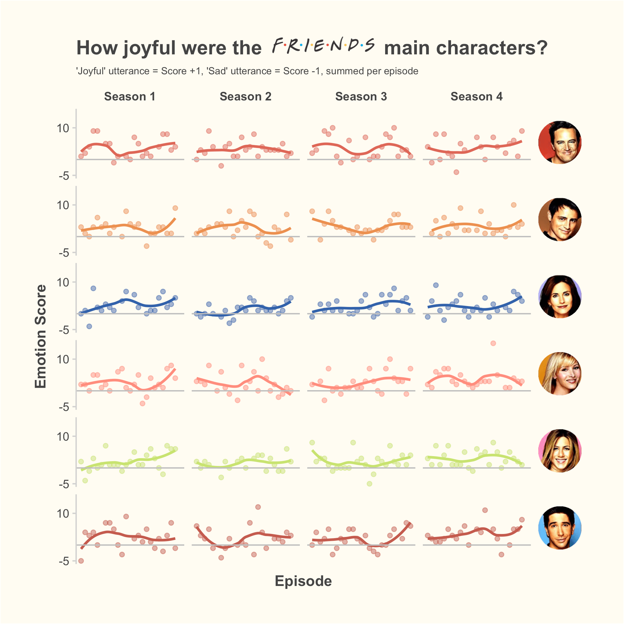
Overall, Friends is a more joyful show than not! 1 Mind, the ’emotions’ dataset only seems to cover seasons 1-4, so that’s what ended up on the plot. 2 Generally characters finish seasons on an up, except for poor Phoebe with season 2. However Phoebe does also get the highest joyful score with season 4 episode 17, which is the one where she finds out she’s pregnant with triplets, so swings and roundabouts!
Chandler has the least number of negative scores across all 4 seasons with just 5 scores < 0, while Ross has the saddest time of it with 16 scores < 0. However Ross is also the only character other than Phoebe to score above 10 in any episode, twice, so I guess the lowest lows lead to the highest highs?
This plot uses a combination of ggthemr’s ‘pale’ theme 3 further customised to remove some axis lines/ticks and change the background colour. I also used ggtext to add in the TV show logo to the title with element_markdown and <img>, along with glue to create a column of <img> tags containing everyone’s headshots that could be used as a facet label. Before this, I was using just text for facet labels, and I stumbled onto using strip.text.y = element_text(angle = 0, hjust = 0) to turn the facet labels for characters to horizontal and left-aligned, which looks much nicer for this kind of thing so I left it in as a note to future James.
Oh! And I even used my very own tinieR package at the end to reduce the plot file size for uploading to the web. Pretty cool!
Code (also at GitHub):
library(tidyverse)
library(ggthemr)
library(ggtext)
library(tinieR)

ggthemr("pale")

tuesdata <- tidytuesdayR::tt_load('2020-09-08')

main_cast <- c("Monica Geller", "Rachel Green", "Phoebe Buffay", "Chandler Bing", "Joey Tribbiani", "Ross Geller")

data <-
  tuesdata$friends %>%
  left_join(tuesdata$friends_emotions, by = c("season", "episode", "scene", "utterance")) %>%
  filter(emotion == "Joyful" | emotion == "Sad") %>%
  filter(speaker %in% main_cast)

emotion_scores <- data %>%
  select(-text) %>%
  mutate(emotion_score = case_when(emotion == "Joyful" ~ 1,
                                   emotion == "Sad" ~ -1)) %>%
  group_by(speaker, season, episode) %>%
  summarise(episode_score = sum(emotion_score)) %>%
  ungroup()

emotion_scores %>%
  mutate(speaker = str_extract(speaker, "^[a-zA-Z]+"),
         season = glue::glue("Season {season}"),
         headshot = glue::glue("<img src='{speaker}.png' width = '35' />")) %>%
  ggplot(aes(episode, episode_score, color = speaker)) +
  geom_point(alpha = .5, show.legend = F) +
  geom_smooth(se = F, show.legend = F) +
  geom_hline(yintercept = 0, color = "grey") +
  scale_y_continuous(breaks = c(-5, 10)) +
  labs(x = "Episode", y = "Emotion Score",
       title = "How joyful were the <img src = 'friends-logo-tr.png' width = '90' /> main characters?",
       subtitle = "'Joyful' utterance = Score +1, 'Sad' utterance = Score -1, summed per episode") +
  facet_grid(headshot~season) +
  theme(#strip.text.y = element_text(angle = 0, hjust = 0),
        strip.text.y = element_markdown(angle = 0, hjust = 0),
        panel.grid = element_blank(),
        axis.line.x = element_blank(),
        axis.ticks.x = element_blank(),
        axis.text.x = element_blank(),
        axis.title = element_text(face = "bold"),
        strip.text.x = element_text(face = "bold"),
        plot.title = element_markdown(size = 16),
        plot.subtitle = element_text(size = 8),
        plot.margin = margin(1, 1, 1, 1, "cm"),
        plot.background = element_rect(fill = "#fffcf2"),
        panel.background = element_rect(fill = "#fffcf2"),
        strip.background = element_rect(fill = "#fffcf2"))

ggsave("friends-plot.png")
tinify("friends-plot.png")
