

In my last blog post, I explored the data that resulted from my undergraduate dissertation a little bit more. As I say in that post, I know it’s a little frowned-upon from a purely scientific point of view to double-dip on your data, but I can’t resist going back to that well.
So I got curious; my dissertation focused on movement choice and landing style as factors affecting ground reaction forces (GRFs), but I’d collected a bunch of characteristic data like age, height, etc. about the participants that went mostly unused. Could any of these also play a role in how well someone mitigates their GRFs?
I played about in RStudio for a while so try and explore this question. I’ve decided to stay away from much in the way of formal statistical tests in this post, and instead just tried to visualise things with a little commentary. This is mainly just to avoid anyone grabbing an offhand t-test result and declaring “tall people are statistically worse at parkour” somewhere. I just find it interesting to look at these connections (or really, as you’ll see, the lack of them) as a way to prompt questions for the future.
Regression and correlation
The first subset of characteristics were continuous variables, things like age, height, etc, and so it seemed that a linear regression would be a nice, simple way to visualise how two variables may relate. I decided to focus on just vertical GRF over horizontal (for a short primer on types of GRF, check out my resultant forces post), just because it’s often the most relevent to jumping and I didn’t want to completely overrun this post with plots (and I normally love plots).
I also chose to keep the breakdown of movement and landing style in each plot. This is how the original study ran and it made sense to me to break things down this way, to keep the data within each movement/landing style as homogeneous as possible.
For each plot, the blue points are the individual data points from each participant for that movement/landing style. The red line is the linear regression, which is the straight line that best fits the data - that is, that best fits in such a way that it minimises the distance between the line and all the data points as best as possible. The fainter red area around the regression line is the standard error (SE). The narrower the SE is, the less varied the data is, which means any correlation found may be more reliable.
Generally, the less ‘spread out’ the data points around are the line as it goes either up or down, the stronger the correlation between the variables (either positively correlated if the line is going up from left to right, or negatively if it’s going down). To help with this distinction, I’ve also annotated the plots with Pearson’s R, which is a numerical representation of the strength of the correlation relationship. The closer R is to 1, the stronger the correlation. A hazy cloud of points means there isn’t much correlation, while a perfect line indicates a very strong correlation. The ‘steepness’ of the line doesn’t indicate much about the correlation, but does kind of indicate how much a unit change in one variable affects the other - the steeper the line, the more a change in y produced by a change in x.
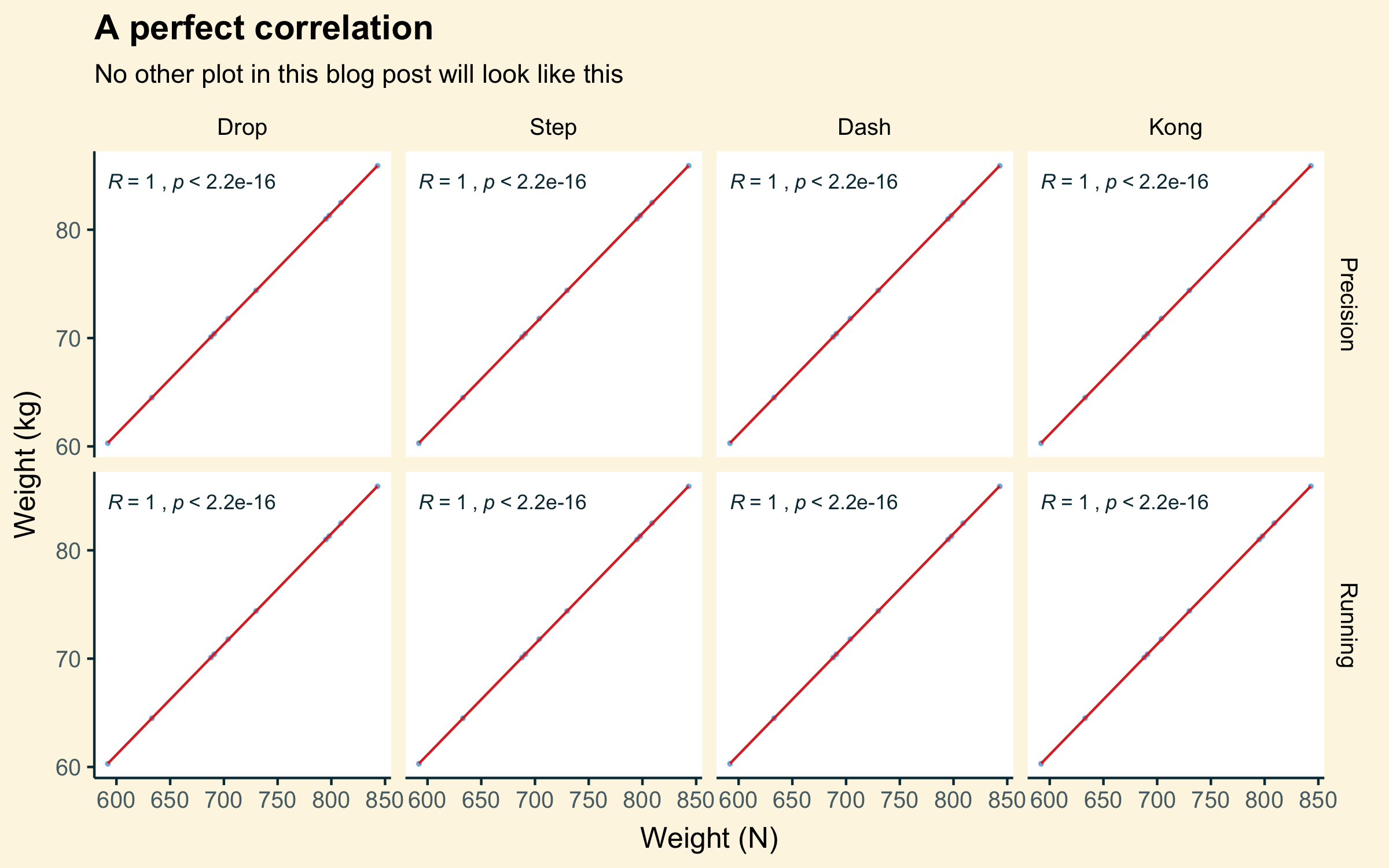
Just as an example of perfect correlation, from the parkour vaulting data - the plot below plots the participant’s weight as recorded on the force platform in Newtons against their weight calculated in kilograms. As the Newton-to-kilogram conversion is the same for each weight recorded (Newtons divided by 9.81 for earth’s gravity), they always correlate perfectly. As weight in Newtons goes up, weight in kilograms always goes up by the exact same amount. On the plot, this means a perfect 45° line of data points, an equally perfect linear regression line, and no SE shading at all.
Of course, correlation does not mean causation, so it’s important to note any relationships found with these plots doesn’t automatically mean one causes they other; there could be many reasons for the relationship outside of the two variables under the microscope. I’ll mention that a little bit more as we go.
Age
Let’s start with a simple one. What effect does age have on vertical ground reaction force?
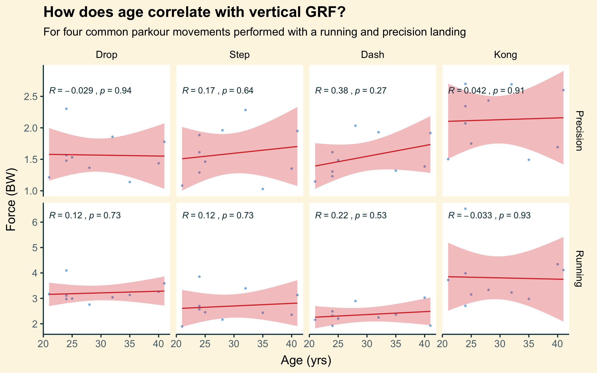
The age of participants in this study ranged from early 20s to early 40s. That’s not covering every age bracket but it was pleasingly wider than the average age of traceurs, which skews young partly because of the urban-cool imagery of the sport but also because it’s just not been around long enough for many practitioners to really get old (although we’re getting there, aren’t we? Oh god my knees).
Age is a common enemy for athletes of all disciplines. For traceurs, the onset of osteoarthritic conditions, cartilage breakdowns, and increases in tissue healing time may present risks for joints placed under frequent high impacts, particularly in the lower body. Sarcopenia may result in the loss of muscle mass, reducing the ability of leg muscles to eccentrically absorb impacts and raising GRFs.
Fortunately, from this data alone, that doesn’t seem to be kicking in for our traceurs. The SE is pretty wide for most of these, so it’s difficult to draw too many conclusions from this, but it can at least be said that no obvious relationship exists. Continued exercise and training has been shown to combat many of the detrimental effects of aging, and I see no reason to think it’s not the same for our traceurs.
Training experience
If anything, the (slightly) older guys in the study had been training for longer - perhaps training experience offsets the effects of aging? Does practice really make perfect?
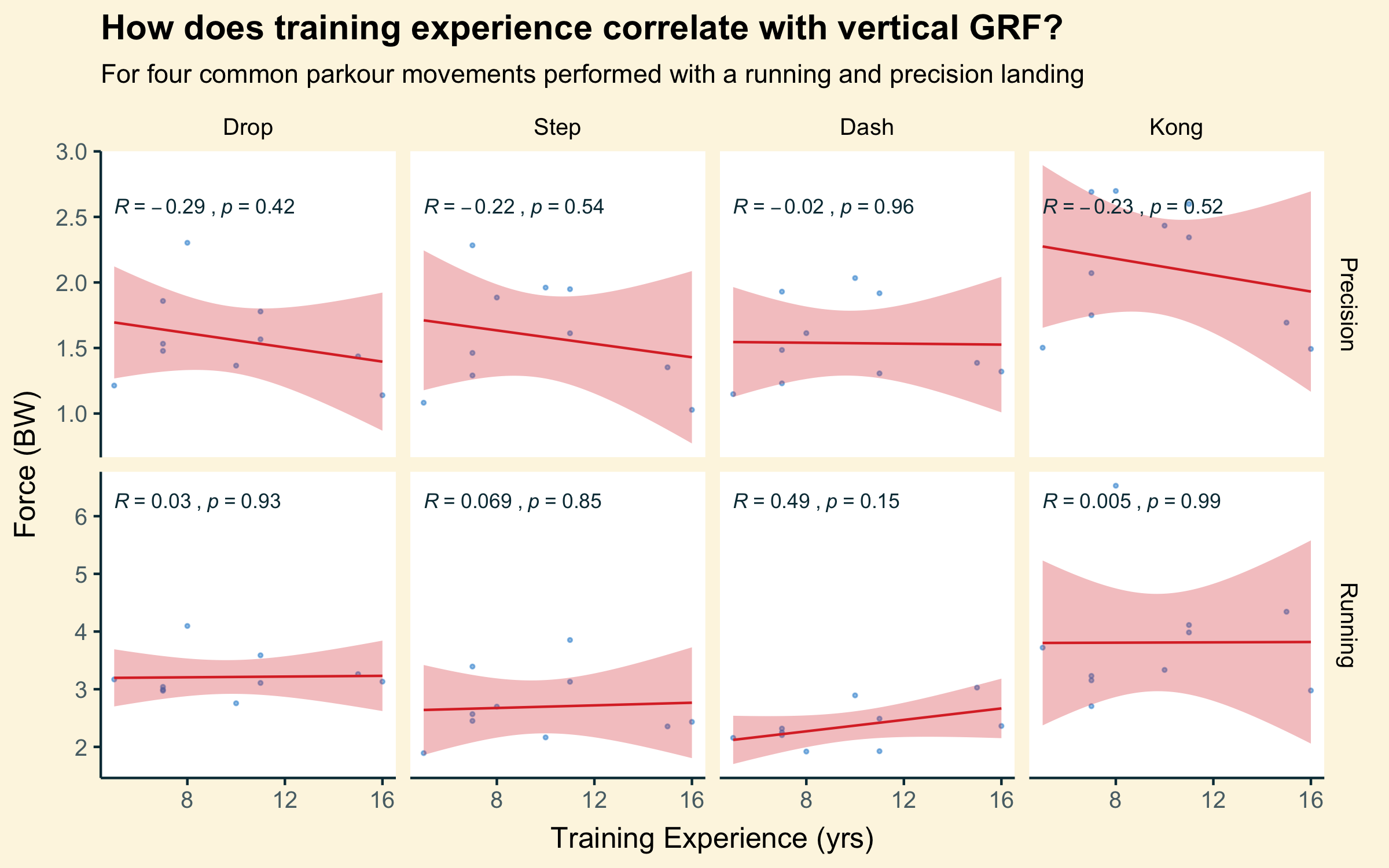
No, not really.
There is some, very slight, evidence of a downward trend in vGRF for the precision landing style as you gain more training experience, but weirdly the opposite for the running style landing. It’s all very weak though, and those SEs…
Even the least experienced traceur in this study had been practicing for 5 years. That’s still a pretty long time - you certainly couldn’t call any of the participants novices. And that’s not including any other sport or fitness experience before they started training parkour. The law of diminishing returns may be at play here, with the difference between 5 and 15 years experience being far less than might be seen between, say, 1 and 5. It would be interesting to run something similar but include much ’newer’ practitioners.
Height
Okay, let’s go back to some more physiological reasons. The study involved a vaulting box of a fixed height, so perhaps the various heights of the participants would interact with the height of the box differently and result in vGRF changes?
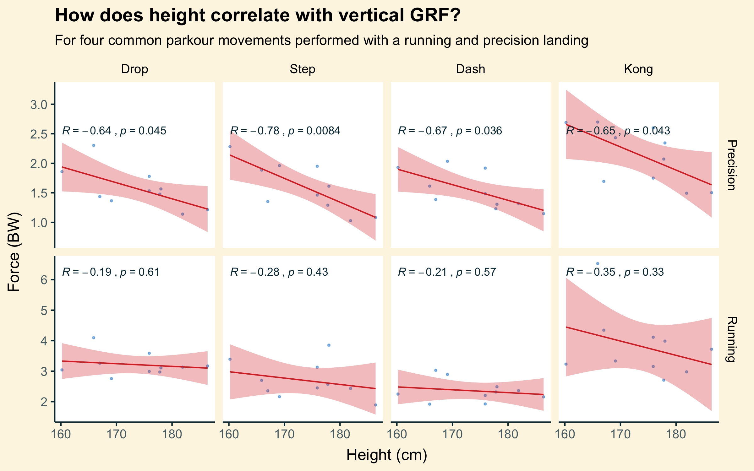
Actually, maybe!
There is certainly a stronger relationship seen between height and vGRF for the precision landing style, with vGRF decreasing the taller the participant. Purely as a function of distances travelled this makes sense - a shorter participant is falling a greater percentage of their overall height than a taller participant.
I can also imagine that taller participants had to jump less to clear the obstacles, generating less force in their take-off and potentially resulting in an overall decrease in momentum throughout the movement that they then had to re-absorb on landing.
Unfortunately, this speculation doesn’t really extend to why we don’t see the same relationship in the running style landing. The best I can think of is that there is a key biomechanical difference between two-leg and single-leg landings. Studies have found flexion at the knee is drastically lessened in single-leg landings. Does this even the playing field? Are taller traceurs actually mechanically better at absorbing GRFs due to the longer levers of their leg? And so if the ability to flex at the knee is taken away or reduced, they can’t benefit from it as much?
This one stumped me a bit. I’d be curious to hear if anyone out there has any thoughts.
Weight
Well this one should be obvious. The heavier you are, the more GRF you should be generati-…
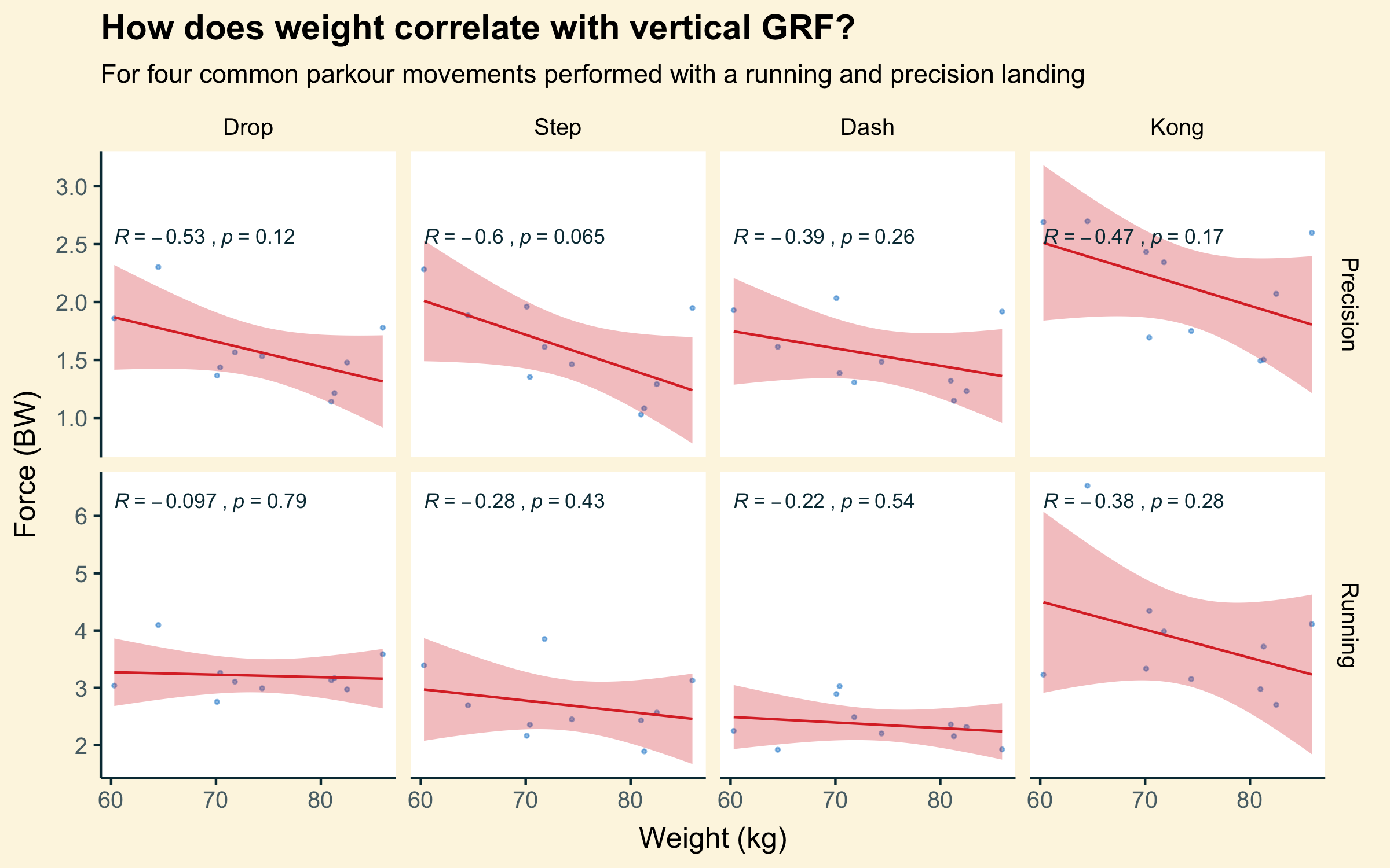
Huh.
It’s not all that strong, but there seems to be a negative correlation here. That is, the heavier you are, the less vGRF you produce. What?
It’s worth noting that the force readings for this study (and all these plots) were standardised to multiples of bodyweight (BW). 1 Weight and force were both initially measured in Newtons on a force platform. So, if one participant landed with a force of 600 Newtons, and they weighed 600 Newtons, they got a result of 1 x BW for that landing (600 / 600). If they landed at 1200 Newtons, they got 2 x BW (1200 / 600).
If someone weighing 1000 Newtons landed with a force of 1000 Newtons, they also got a result of 1 x BW (1000 / 1000). Generally, 1 x BW is the force you’ll be exerting on a force platform if you are just standing still on it.
So, in this plot, the heavier participants towards the right of the x axis are most likely still landing with more absolute force - that is, higher Newtons. You can see that if I take the previous plot and change the force units on the y axis back to Newtons:
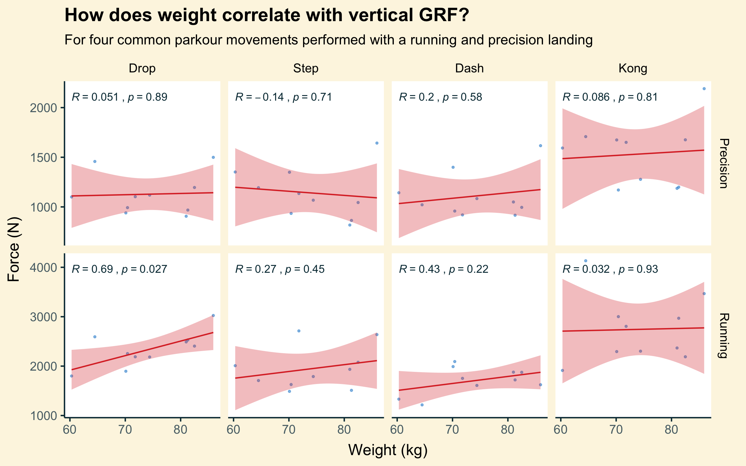
Here’s that mostly upward trend we were expecting before. A good demonstration of why the units in a plot matter!
Still, it’s interesting to note that the heavier participants in this study were landing with lower multiples of their own bodyweight, or lower relative force. Perhaps they were heavier because they were more muscular, and better able to absorb their GRFs? Maybe they were heavier because they were taller, and therefore actually we’re just seeing another version of the height plot above? Oh no, now I have to go back and look at that plot again…
It’s a good example of why you can’t take variables in isolation, and why it’s so hard to conlusively prove the effect of some interventions. You have to control for these things and try and tease apart the relationships to make sure you aren’t just measuring the same thing twice!
Vertical and horizontal GRF
I was also curious, are the vertical and horizontal braking parts of a GRF correlated themselves? After all, in the ‘real world’, they’re really just components of a larger resultant force.
Plotting them against each other gives us this:
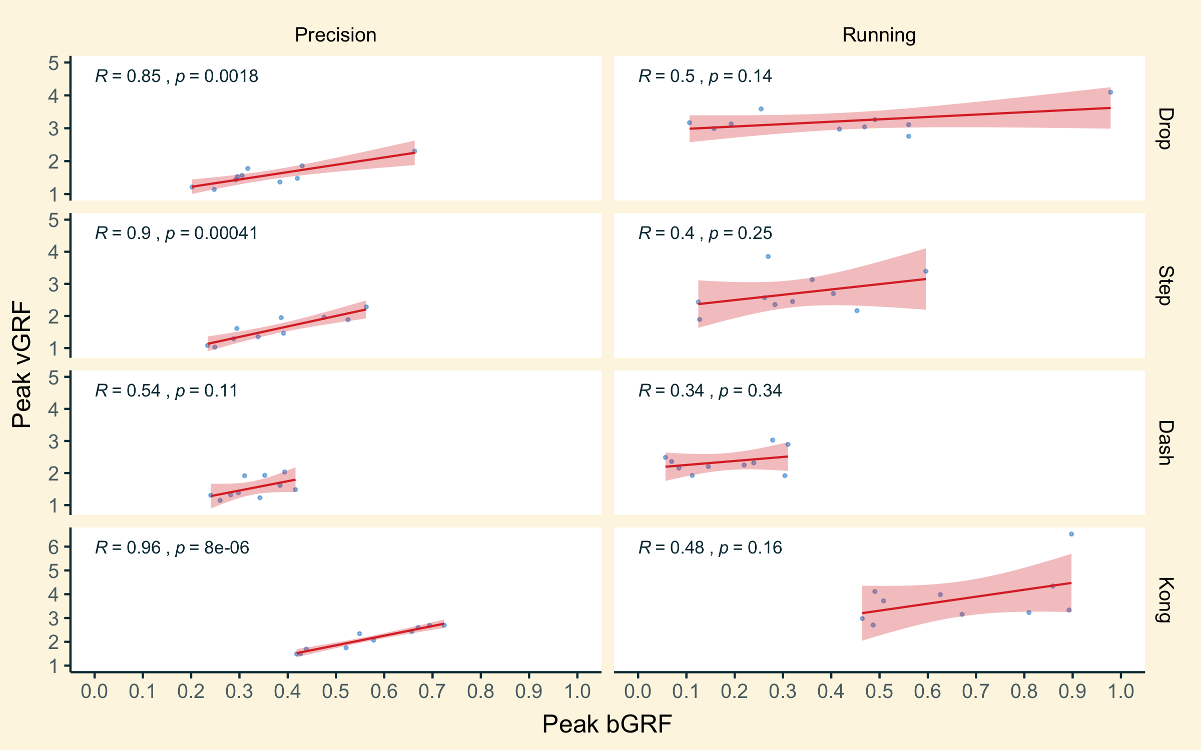
It varies from movement to movement, but there is some mid-to-strong correlation between the two for precision landings, with weaker correlation for running landings.
If you’re coming to a complete stop with a landing, you’re applying the brakes in both directions - vertically and horizontally. So it makes sense that they would kind of sync up - the harder a landing, the greater force in both directions the ground will produce to deal with it and bring you to a stop. With a running landing, you are trying to arrest your downwards vertical motion, but not your horizontal motion - if anything you’re doing the opposite and trying to minimise horizontal braking entirely to avoid slowing down. This desyncs the goals for vertical and horizontal GRF production, reducing their correlation.
It might be interesting to see if there’s a resulting correlation between vertical and propulsive horizontal force instead in running landings. I don’t have that data to hand but it could be worked out from the raw force platform data collected for the dissertation project. I may come back to it, or if anyone out there wants some homework…
Landing foot
Finally, moving away from regression and correlation a bit, I also asked participants which landing foot they preferred to land on for single foot landings. Would this make a difference to vGRFs?
This one just involved two categories, left foot or right foot, so a correlation/regression plot wouldn’t work, so this one is a boxplot with a simple t-test performed between the two groups (annotated by the lines at the top of each plot square).
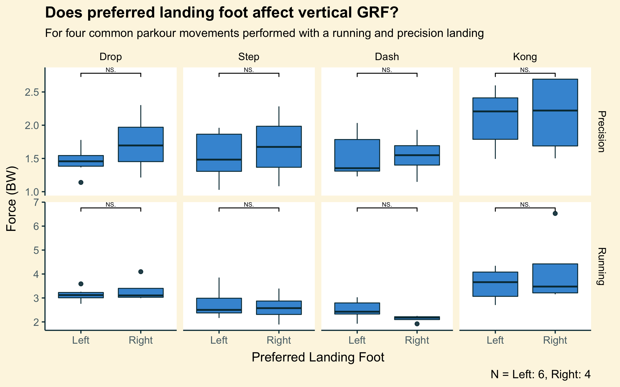
Sometimes, lefties did better, and sometimes righties did. But, there was never a significant difference between their results. And good thing too! Otherwise, we’d be teaching everyone to land on the same foot all the time. This was one plot I was happy to find absolutely nothing worthwhile in.
Of course, it would still be interesting to see how performance differs between their own two feet for traceurs… But that’s another study for another time.
Thanks for reading. If you enjoy this kind of nerdy deep dive on parkour movement, you can check out the original study this data came from here and even grab the data for yourself if you would like to perform your own analysis. You can also view the source code for all the plots in this post here.
-
You can see this in the plot at the start of this post showing perfect correlation, because weight in Kg and weight in Newtons are just measuring the exact same thing. ↩︎
